
Soluna
Creating visual identity for a holistic aromatherapy business, Soluna.
Brand Identity | Packaging | Social Media
Essential Oil - Packaging


Two scents of pure essential oils with their respected color schemes.
Honey and Ginger - For scent sensitivities and to help relax.
Goldenberry and Lavender - Refreshing and clean scents that are a little bit tropical.
These are two different concepts and layouts of presenting the labels for the essential oils.
Essential Oil - Mockup

Candle mockup


Website Mobile mockup


Website Mobile mockup
Billboard mockup


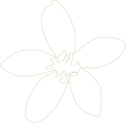
Sketches

"Sol-" meaning sun
"Luna-" meaning moon
The combination of their brand name was the starting point of my research
I thought of elements that are related to the sun and moon such as environmental items or stars.
I was combining them with holistic and images related to relaxation or spiritual such as leaves or hands.
The final became inspired by dandelions. When they are yellow, they are like the sun, when they bloom into white puffs, they are like the moon, and when they spread their seeds, they are like the stars in the sky.
Color Iterations
Final color iterations consist of earthy neutral tones, and warmer tones.
The main brand colors consist of a pale yellow for the logo and font with a dark burnt orange color as the backdrop.


Hex: #EED791
Hex: #9E3FF2

