
Cattery Cafe
Creating an animation and letter mark for a cat cafe business.
Branding | Animation
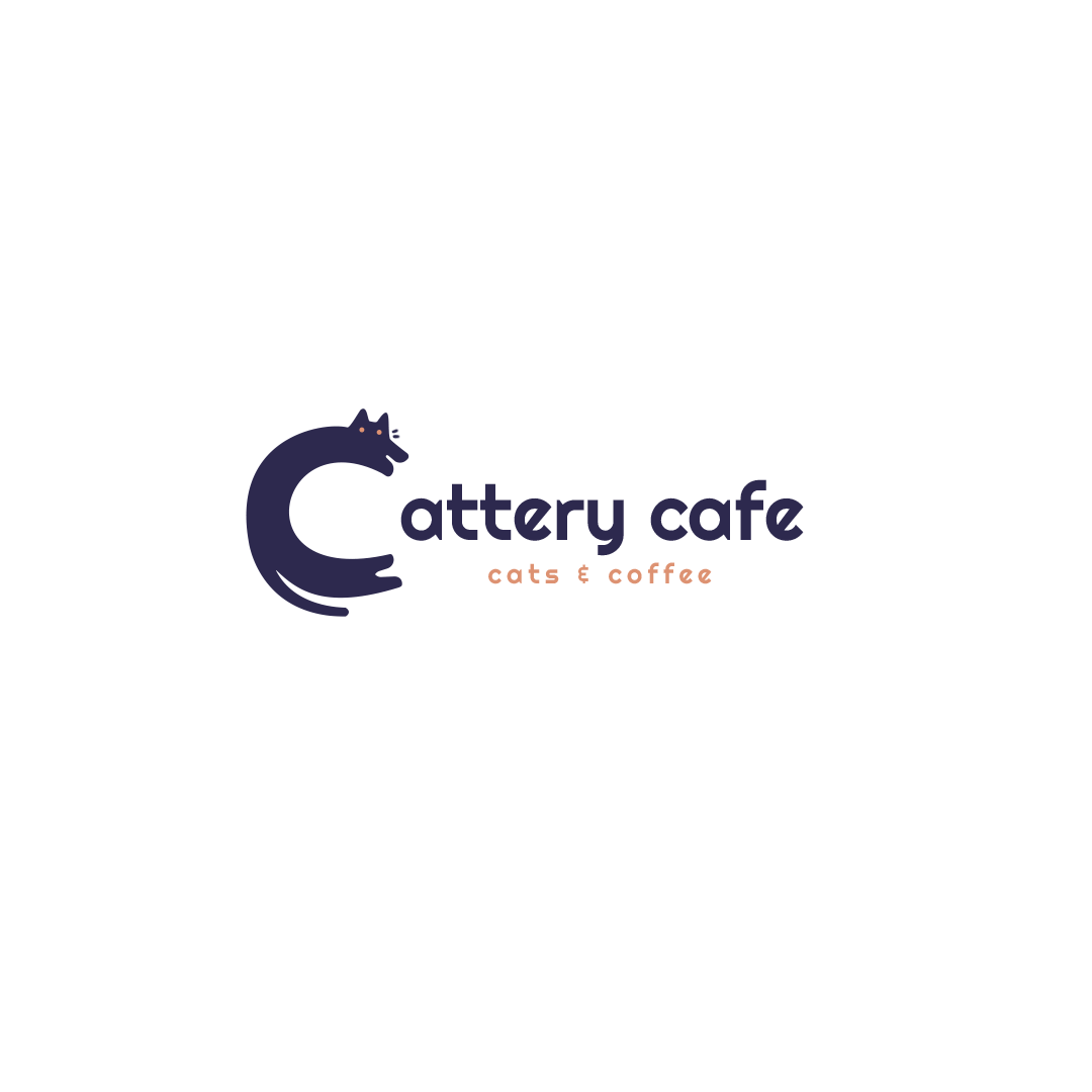

For the letter mark, I decided to envelope the entire letter "C" with the cat instead of having the letter show only part of the cat.
The qualities of a cat that people often think about include softness, roundness, flexibility, and stretch. I wanted the letter to highlight the roundness and stretch ability of a cat similar to how they will elongate when being picked up.
I knew that I wanted to do a café since I enjoy coffee a lot, and cat cafes were becoming popular.


SKETCHES


I started with the letter "K" instead, just thinking about the café and coffee in general.
General thoughts when designing "K"
-
Fluidity of the liquid
-
The coffee bean
-
Cup of coffee
-
Coffee machine/kettle
With the letter "C", it incorporated both the café and cats into each other.
Process
-
The cat itself
-
Paw prints of the cat
-
Coffee pot in the shape of a cat
-
Coffee pot cat
-
Pastries in cafes in a cat shape
Color Iterations
Font exploration
I pulled colors based on combinations that felt cozy while keeping the colors of the font related to the realistic colors of a cat: white, orange, brown, black.
Colors that did not work - since they were too closely related to Halloween colors
-
Black and Orange
-
Black and Purple
I settled on a Dark Blue that looked close to black, and an orange creamsicle color that was similar to coffee with milk
I searched for mainly sans serif fonts and ones that were heavily rounded to keep with the characteristics of a cat.
The letter mark fit the fonts that were thicker and were similar in weight.
The final font style landed on Righteous. The font exemplifies other aspects related to being a cat. The dynamic tilt of the "e" and the letter "a" has spurs that make it similar to the shape of a fish.
Menu Mock up


This menu was created independently from the original project.
It explored composition and menu layouts - it is a one sided menu.
I wanted to keep the same color scheme as the logo as it contrasted well.
I kept it lighthearted and cute with the paw print and the fish in the background.
The menu items are inspired by healthy foods and treats that cats can consume without harm.